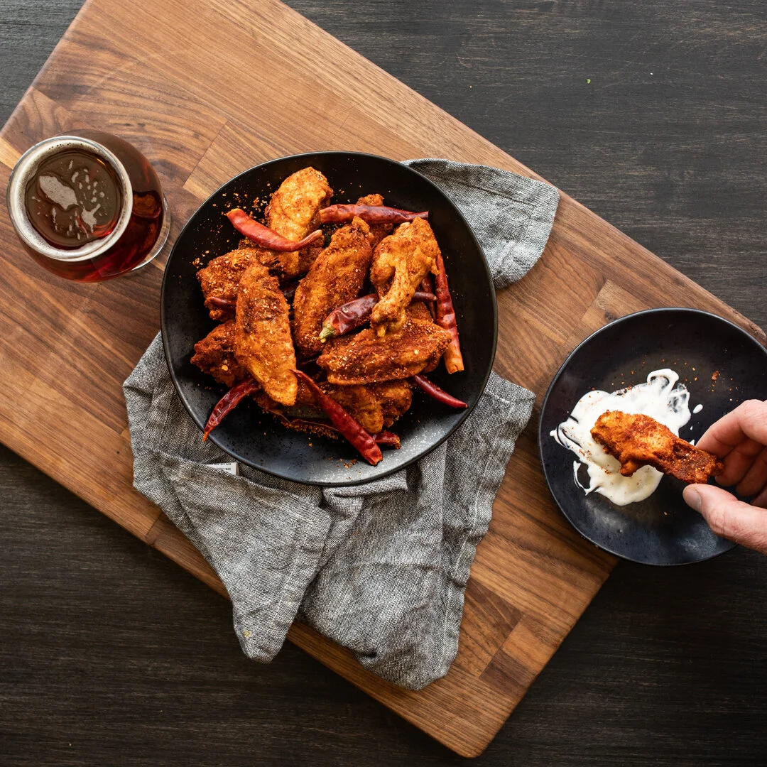
Twisted Tenders is a virtual kitchen so underground that you can’t even find it in real life. It’s 100% Virtual and lives within 200+ Restaurants throughout the United States. With COVID-19 and the increase of take-out & delivery, “Ghost Kitchens” or “Virtual Kitchens” are popping up left and right in the Restaurant Industry.
With Covid cases on the rise, and more restrictions being put in place, we needed to move fast. We launched this bad boy in record time- 2 WEEKS. Literally from conception to launch. I started thinking about who’s doing the most online ordering and to no surprise- it’s 90’s kids. So what better than to make this the ultimate 90’s concept.
The bright colors & funky fonts are what 90’s kids dreams are made of. Chicken, Wings, Kettle Chips, Mac n Cheese- these foods are all the same colors so I knew we needed them to stand out and spice it up with our styling. Pair that with the bright & contrasting colors of the sauces and the results turn out pretty rad.
All creative direction was led by myself including initial concepting, photography, design, and final production with the help of my marketing & culinary team.
Branding | Creative Direction | Photography | Web Design | App Design
Rock Bottom is a pioneer in the brew-pub industry. Opening it’s doors in Denver in 1991, it was leading the industry for decades when it came to beer & casual bar food.
But over the years the concept became tired. It certainly was seen more as “your uncle’s favorite bar”. With the massive increase in local breweries across the country, people started to flock to the new and forget about older breweries.
My team and I, with the help of our partners at Articulation, worked tirelessly to develop an entire new brand DNA for Rock Bottom that appealed to a much younger demographic, and also skewed more feminine, which is a rarity in the craft beer industry.
Re-imagining everything from beer vessels, to menus and menu items, to campaigns- we really flipped this brand upside down. We leaned more into the name “Rock” with some subtle nods to music and continue to push that concept as we get further into exploring our options with this new brand identity.
ZAUCE is a line of personal sauces from Craftworks Holdings corporate Chef , Chef Zack. I was asked to create some branding surrounding his line of sauces.
This sweeping smear concept has a great amount of movement. It’s difficult to show sauce without feeling messy and I think this concept is a great example of showing the beauty in cooking.
Top of the Rock is a new sub brand of Rock Bottom Brewery. Our goal was to really elevate guests experiences on the Rooftop Patios in certain cities. We started with Nashville.
We focused on attracting a younger demographic, specifically females- considering “Nashvegas” is the new hotspot for bachelorette parties. Along with a full brand refresh the rooftops are getting solid renovation to really tie this vibe together.
My role in this project was art directing the interior proposal, building a menu, in-store POP, Signage and a digital campaign that brought the modern rooftop vibe to life.
Photography | Creative Direction | Web Design
Ember Smoked BBQ is not your average BBQ joint. It’s our take on the new age ‘Cue. Since the brand lives completely virtual, it was vital for us to portray this new trendy vibe for guests who would never set foot inside an Ember restaurant.
I worked with our partners at Articulation to bring it all to life. Our main goal being to disrupt the BBQ industry that’s filled with retro, masculine branding and bring a younger, slightly more feminine identity to the Ember brand.
Ember was the tip of the bucket to get our Post Covid-19 sales to positive. Launching in over 100 locations, Ember sky rocketed to the top of our internal brands in sales. Hitting over $1M in a matter of a few weeks.
Indy Realtors and Mother Daughter Duo, Paula and Melissa, launched their Family Real Estate Business at the start of 2021.
6 months prior they reached out to me to help build their brand. They wanted something clean but still warm and inviting. They wanted to showcase their homegrown roots and personal service from start to finish. Along with these requirements they wanted it to feel like a women owned and operated business but didn’t want to feel too feminine.
For the logo we landed on the a delicate roof shape paired with a simple bold typeface for SMITH. To stay true to their Indiana roots I implied the shape of Indiana to the H. It’s subtle and a fun surprise when you notice it.
All art direction and design from initial logo concept, style guide, color palette, font and iconography package, and web design was lead by myself.
Old Chicago has a loyalty base like no other. Boasting it’s 70+ local & legendary beer selections along with classic pizza favorites, it’s easy for this taproom to become a neighborhood favorite for any occasion.
The World Beer Tour and Mini Beer Tours allow their loyalists to drink beer to win prizes- and the redemption rate is absolutely mind boggling. For the past year and a half I have led the creative direction in all things Old Chicago. Everything from content creation, social strategy, Mini Tour Campaigns, as well as a full rebrand in late 2020. One of the most successful campaigns was the 2019 Summer Baseball Mini Tour. During this campaign, same store sales were up over 33% from previous years. Making it one of the most successful mini tours in OC history.
Logan’s Roadhouse was in a bit of an identity crisis when I started working on the brand. They boasted an approachable, authentic roadhouse experience yet all of the photography was very sterile and staged - everything felt disconnected.
We worked on giving the entire brand a little facelift and making it all feel more approachable. Really leaning into the Roadhouse look and feel without alienating certain guests across the country.
In the Summer of 2020 I started to lead all creative from menu design, photography, merchandise, social content strategy as well as the launch of the Roadies Sliders Ghost Kitchen - which was a whole line of sliders extending from the famous Logan’s Roadies Sliders.
One thing I was incredibly proud of when I started taking over the social content was how quickly engagement grew on our platforms. We went from an average of 400 likes per post on Instagram to over 1,000 almost over night!
The Old Chicago Gridiron Mini Tour is a fan favorite every year. I led creative direction, content creation, tee shirt design and execution of all design within the suite of materials.
Holiday promotions are always a challenge creatively. It’s incredibly easy to get get cheesy quick with your artwork so while concepting this mini tour suite of materials I knew I wanted to tie beer into the holidays but do it in a clever way. We ended up taking the “It’s Reinbeer Season” route. The sweatshirt artwork shows a 6 pack of beer with antlers as they mimic cute reindeer in front of Santa’s sleigh.
I wanted to make the texture feel warm and fuzzy like the relatable Holiday Sweater and think I achieved this nicely. During the campaign we also had a gift card promotion where we had seasonal gift card artwork. One of the gift cards portrays an Old Chicago sleigh carrying a keg while the other was a Pizza Christmas tree.
I led all concepting, creative direction, photography and execution of designing the materials for the entire campaign.
Crowlers are changing the way we bring our craft beer home. These 32oz. Crowlers hold fresh, brewed in-house beer that stays fresh longer than glass growlers.
I led creative direction on this campaign from initial concepting of the packaging through the way we marketed the product inside & outside the four walls. The poster was used as in-store POP while the digital campaign was used on social media & email blasts. The goal was to show how easy these Crowlers can go just about anywhere.
Each Rock Bottom limited menu is tied to seasonal beers. To increase traffic and average check we wanted to add an additional summer limited menu that was not tied to a seasonal beer.
Since Rock Bottom is a brewery, we felt we still needed to tie in beer somehow. The way we solved this was developing a summer food menu that had suggested beer pairings for each item. This specific menu style was an outsert that wrapped around the core menu.
During this campaign we partnered with No Kid Hungry and 25 cents from every Kolsch sold was donated to their organization. We ended up raising over $43,000 for the cause. All creative direction was led by myself including initial concept, photography, layout design, and final production with the help of my marketing & culinary team.
From 2015-2017 Green Flash and it’s sub brand Cellar 3 were two of the brands I worked on from a day to day basis. Green Flash is all about beer enlightenment. We always wanted to focus our efforts on beer education- but not in a “beer elitist” way.
Along with working on national beer campaigns, I worked closely with the sales teams to develop materials they needed to sell beer across the country. Event posters, tap handles, window clings, truck wraps, merchandise & more along with creating content for our social platforms through art direction & photography.
Rock Bottom Firechief is an annual Red Ale brewed across the country at all Rock Bottom locations. Each year during this campaign we develop a limited Firechief food menu that compliments the beer. 2020 we took quite a spicy route.
25 cents from every Firechief Ale sold went to a local firefighter’s charity in each individual store’s town. Since last year we have raised over $100,000 for local firefighter’s charities.
I led all of the creative direction on this campaign from initial concepting, to layout, to photography with the help of my marketing and culinary teams.
Wicked Elf is the annual Holiday Seasonal beer brewed by Rock Bottom. Each year a new food menu is developed to pair with the beer. With each Wicked Elf sold, 25 cents is donated to a local charity. In 2019 alone we raised over $30,000 for local charities in the towns where Rock Bottoms were located.
I led creative direction on this campaign from 2017-2020, from initial concepting, photography, layout, versioning and production work.
How do you make your holiday gift card promo stand out in the “sea of sameness”?
Every restaurant tries to increase gift card sales during the holiday season as they make for great gifts and are often never redeemed.(which makes them super easy revenue drivers.) But with so many promos happening at the same time, it can be difficult to stand out.
The purpose of our Rock Bottom “Reinbeer” Gift Card promo was to help drive sales through gift card purchases. We took a totally different look and feel than a lot of the Rock Bottom branding in order for the materials to stand out in store. It’s really easy to make holiday creative tacky, so the biggest challenge was to keep this fun and beer focused but still drove our holiday message to our guests.
I led creative direction from initial concepting, to final execution on all deliverables.
Gordon Biersch is an incredibly unique concept. A Brew Pub with an elevated experience for every guest. Fresh, Asian inspired fare paired with award-winning, brewed onsite beer. The challenge with this concept was always portraying this elevated experience without coming off stuffy or sterile. I believe we achieved this through simplicity in the design aesthetic.
From 2018-2020 I led creative direction on this brand. With strategic menu engineering, we saw significant increase in average check during this time.
Rock Bottom boasts the status of being the Original Brewpub. With growing it’s national footprint since the early 90’s we wanted to change the guest perception of this concept to more “local brewpub” than a chain restaurant. One of the ways we achieved this was by reducing the amount of plastic inside the restaurant. These menus were designed to be produced on newspaper.
From 2017-2020 I led all creative direction on the Rock Bottom brand.
The Beer Garden campaign was the first limited food specials we ran at Gordon Biersch in the spring of 2020. All previous food specials were tied to a seasonal beer. While we still wanted to show we were a brewery the challenge here was tying the specials to beer somehow.
That’s where “The Beer Garden” was born. All the specials were made with fresh ingredients (including beer!) This allowed us to really lean into the garden aspect, still talking about beer, all while keeping this elevated in-store craft experience. The hops garden gnome really tied it altogether. We encouraged individual stores to buy garden gnomes and hide them around the store. If they were found- the guest got a free beer!
This line of seasonal beer cans for Big River Brewing was designed so the brewery could start selling beer in local markets outside the four walls. Every design has subtle nods to the beer flavor notes, beer name, or Chattanooga, TN (home of Big River Brewing)
I led all creative direction & production on the line from initial concepting through working with the vendor to get these in-store.
This line of coasters was developed for 5 different specialty brand brew pubs. These were print on demand through our designated print warehouse so these couldn’t be brand specific and needed to work in every restaurant.
I kept these as fun pieces of artwork that portrayed a super simple message- “Good Beer Brings People Together”